
Key Takeaways
- Middle-market growth is constrained less by strategy and more by visibility and alignment across functions.
- CFOs drive growth when they unify finance, operations, and technology around shared metrics and faster decision cycles.
- AI and automation accelerate performance, but only when data readiness and governance are in place.
For the modern middle-market CFO, the mandate has shifted. We have moved past the era of growth at all costs and entered a cycle defined by disciplined execution and transaction readiness. It’s about faster decisions, stronger controls, and technology investments that improve business outcomes.
To drive this evolution, CFOs must focus on three high-impact pillars:
Stress-Testing Forecasts Beyond Muscle Memory
Traditional budgeting often relies on last year’s numbers with a slight percentage increase. In a volatile market, this muscle memory becomes a liability.
CFOs must now lead rigorous scenario planning that accounts for micro-fluctuations, such as a 5% dip in customer retention or sudden shifts in pricing flexibility. By modeling these what-if scenarios, finance leaders move from reactive reporting to proactive risk management.
Strategic Capital Allocation
Growth-oriented CFOs are prioritizing capital for high-ROI digital transformation, specifically AI-driven automation.
The goal isn't just to save money; it’s to eliminate operational bottlenecks that prevent the company from scaling.
Talent as a Growth Lever
To support growth, CFOs must upskill their teams from transactional bookkeeping to internal consulting. This means fostering a culture of data storytelling and AI fluency.
When the finance team can translate complex spreadsheets into actionable business insights, they become the strategic engine that helps every other department hit their targets.
The challenge with these themes is that many middle-market organizations still operate with fragmented systems, inconsistent KPI definitions, and cross-functional teams that are misaligned. When that happens, growth creates complexity before it creates clarity.
In practice, high-performing CFOs anchor this work around a simple operating model: balancing performance, protection, and long-term opportunity. Here’s how CFOs can apply this model in real decision-making across finance, operations, and technology.
What Mid-Market CFOs Need to Focus on to Drive Growth
When you strip away trends and noise, growth‑driven CFO priorities fall into five focus areas.
1. Build Visibility That Connects Financial and Operational Reality
Growth stalls when leaders can’t see what’s driving results, or when teams are working from different versions of the truth.
Top CFOs view data visibility as a valuable strategy, linking financial reports with key operational factors like volume, labor, utilization, and inventory turnover. This approach enables leaders to address root causes, rather than just responding to results.
- Dive Deeper: How Top CFOs Use Data to Shape Strategy
2. Increase Decision Speed
CFOs need to help the business model changes in cost, pricing, sourcing, cash flow, and tax impacts fast enough to matter. This is especially true when volatility comes from outside the business. The Duke CFO Survey found CFOs continued to rank tariffs as a top concern and anticipate price increases, reinforcing the need for faster modeling and margin decisions.
In the manufacturing industry, for instance, executives face familiar supply chain challenges, including rising transportation costs, supply delays, and trade disruptions. Manufacturing leaders can increase supply chain efficiency by improving end-to-end visibility with AI and automation, and by ensuring up-to-date information through business-critical systems.
When visibility is top of mind, performance improvement and heightened decision speed follow.
3. Improve Inefficient Processes
CFOs improve efficiency by redesigning workflows so insight is delivered before decisions are required.
You don’t need to overhaul everything to make a meaningful impact; small, targeted improvements can yield significant results.
- Automate routine transactions. From accounts payable and receivable to expense reporting, automation reduces errors, saves time, and frees staff to focus on higher-value work.
- Standardize reporting. Eliminate version control chaos and reduce reconciliation time by building consistent reporting frameworks with defined metrics and automated updates.
- Shorten the close cycle. Establish repeatable processes and accountability to close faster without sacrificing accuracy. A shorter close gives leadership more time to act on current insights.
- Strengthen internal controls. Efficiency shouldn’t come at the expense of compliance. Well-documented processes and clear responsibilities reduce risk and improve audit readiness.
4. Invest in Technology That Reduces Friction and Increases Accountability
Technology isn’t a CFO’s nice-to-have anymore. It’s how alignment and decision speed are operationalized.
Gartner’s budget benchmarking shows CFOs are prioritizing technology: 75% plan to increase technology budgets, and nearly 60% have planned increases to AI investment within finance.
But technology only creates value when modernization is driven by outcomes:
- Fewer manual reconciliations
- Shorter close cycles
- Shared KPI definitions
- Automated controls and auditability
- Scenario capability
- Dive Deeper: CFO Decision Hub for the Middle-Market
5. Use AI Responsibly to Amplify Decision-Making
AI powers everything from invoice processing to anomaly detection to predictive forecasting. But this type of decision-making only works if you have a solid AI strategy that includes:
- Clean, centralized data
- Solid systems integrations
- Defined AI use cases and goals
- A governance model
Once those pieces are in place, CFOs can begin to build AI strategically into their organization. Common use cases include:
- Automated monitoring of tax regulations and calculation of obligations
- Anomaly detection in financial records, workflow optimization, and seamless data exchange across systems
- Improved financial data analysis with automated detection of outliers and warning signs in datasets
- Predictive maintenance through analyzing sensor data to forecast equipment needs and repairs
- Dive Deeper: A CFO’s Guide to Responsible AI
How Middle-Market CFOs Align Finance, Operations, and Technology Around Growth Metrics
This is where most middle-market organizations struggle: not because they lack KPIs, but because they lack a shared operating rhythm.
Here’s a practical framework CFOs can use to align the organization around growth metrics that drive action.
Step 1: Define a small set of “shared truth” metrics.
Select 6-10 metrics that connect growth goals to operational reality, such as:
- Gross margin
- Cash conversion cycle
- Forecast accuracy by product/region/segment
- Inventory turns
- On‑time delivery / throughput
- Customer profitability and retention
Step 2: Turn dashboards into decision workflows.
CFOs align finance, operations, and technology by setting shared metrics, defining decision ownership, and enforcing a consistent decision rhythm.
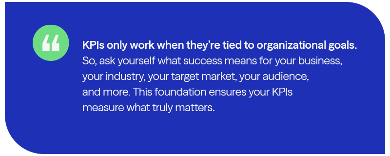
KPI reporting begins with aligning your KPIs to business objectives and organizational priorities.
- Ensure each KPI serves a specific decision-making purpose
- Include KPIs that directly connect to departmental and organizational goals
- Ask yourself: what decisions need to be made, and how can these metrics drive action?
From there, design your KPI displays to ensure critical information is accessible and actionable.
- Weekly performance reviews (actuals vs drivers)
- Monthly scenario reviews (margin, cash, volatility)
- Quarterly capital allocation decisions (technology, talent, risk)
When users can immediately spot and understand important shifts in their metrics, they can respond quickly.
Here’s the truth: your KPI dashboards must support proactive decision-making. Otherwise, they’re just for display.
Step 3: Embed metrics into daily decision-making.
When data lives in silos, teams build their own logic, definitions, and dashboards. That creates conflicting numbers, slow decision cycles, and low confidence. Reducing friction in data visualization is key to fostering a data-driven culture.
Here are a couple of ways to get started:
- Understand Key Aspects of User Empowerment: Intuitive, self-service analytic tools allow your team to explore data, create custom views, apply filters, and pivot analyses with ease. By making data exploration accessible, you can independently find information and quickly address challenges.
- Integrate Solutions Through Connected Systems: Integrated visualization systems connect dashboards to tools like supplier portals, ERPs, CRMs, and WMSs. This gives you a command center, enabling immediate action on insights, streamlining workflows, and eliminating system switching.
What This Looks Like in Practice: Reporting in Action
Manual processes, reactive guesswork, and spreadsheet reports were holding one of our clients back from reaching their goal of growing their customer base.
Automated dashboards reveal top-performing campaigns and creatives by tracking conversion rates, customer acquisition costs, and engagement metrics in real time. With real-time margin and customer profitability visibility, finance leaders redirected spend toward higher-return segments while tightening controls elsewhere.
A CFO Operating Model for 2026 and Beyond: Perform, Protect, Prosper
For middle-market companies, alignment often breaks down not because of a lack of tools, but because of a lack of integration between governance, risk, and finance systems.
To bridge the gap between finance, operations, and technology, CFOs must move from being scorekeepers to strategic navigators. A simple way to keep priorities aligned is to organize CFO leadership around three business outcomes. Together, these outcomes define how modern CFOs balance speed, control, and strategic optionality in the middle-market.
PERFORM: Clarity, Speed, Visibility
- Connected visibility across finance and operations, including ERP and CRM integration
- Decision cadence and forecasting discipline
- Automation that reduces close and reporting friction, like AI-powered dashboards
PROTECT: Compliance, Security, and Resilience
- Audit-ready documentation and controls
- Governance for AI and core metrics, including role-based accountability and workflows
- Scenario planning for volatility and regulatory changes
PROSPER: Long-Term Growth, Strategic Investment, and Potential Exit
- Investment prioritization tied to measurable outcomes based on predictive modeling rather than backward-looking reports
- Modernization aligned to business strategy
- Proactive tax and risk planning that supports reinvestment
If you’re building this operating model and want a practical checklist for improving real-time visibility, modernizing systems, and approaching automation and AI with discipline, our Future‑Ready CFO guide outlines what forward‑thinking finance leaders are prioritizing to strengthen their finance foundation.
Frequently Asked Questions
What should middle-market CFOs prioritize first to drive growth?
Start with visibility into performance drivers: consistent metrics, connected data, and a recurring decision cadence. Without this foundation, growth initiatives and technology investments compound complexity instead of improving outcomes.
How can CFOs align finance, operations, and technology around growth metrics?
Define shared metrics, integrate data across systems, operationalize a decision cadence (weekly/monthly/quarterly), and add governance, so speed doesn’t introduce new risk — especially as AI expands.
Where does AI fit into the CFO’s growth strategy?
AI supports faster forecasting, anomaly detection, and automation — but value depends on data readiness and governance. CFOs play a central role in ensuring AI initiatives are measurable, controlled, and scalable.
Why are tariffs and tax policy relevant to CFO growth leadership?
Because volatility affects margin, working capital, and investment decisions. CFOs need an operating model that assumes ongoing disruption and supports rapid scenario planning.

Get insight at the speed of now with accurate, reliable data that flows seamlessly through your organization.
Who We Are
Eide Bailly is a nationally ranked accounting and advisory firm bringing financial, operational, and technical solutions to middle market and high-growth organizations.